 My Second Life
- Section
- 03 Wise
- Reading
- 11 min
- Published
- Sep 2026
AI Is a Lousy Designer. Bring Your Own Taste.
Pinterest for the eye, Claude for the thinking, Canva and Figma for the testing, Higgsfield for the pictures. How I stop AI handing me the same purple website as everybody else.
Ask AI to design you a website and it will happily oblige. The result will look exactly like everybody else’s.
Purple gradient. Headline on the left, a floating card on the right, a pill-shaped button underneath. You have seen it a thousand times this year, probably without noticing, because it has become the visual version of lift music.
The model is doing what it was built to do. A large language model predicts the most likely next token, and human raters have trained it to make safe choices that please the most people. Colours, layouts and fonts all drift towards the average of everything it has ever seen. Anshu Chimala, who led software engineering and design teams at Apple for twelve years, calls it “the ultimate case of design-by-committee” in a very good piece for Lenny’s Newsletter this month. He’s right. Great design starts with a feeling and makes choices you don’t see coming. A model left to itself makes the most predictable choice at every step.
The fix is easy to describe and hard to do: the taste has to come from outside the model. From you.
Here is the workflow I’ve settled on and actually used to produce this website (steal it). It runs in five stages, with a different tool leading each one, and Claude sitting in the middle doing the heavy lifting while I make the calls.
The model supplies the speed. You supply the taste. Get that the wrong way round and you get slop.
1. Start on Pinterest, not in the chat box
The worst place to start a design is a blank prompt. Type “make it modern and clean” and you get back the average of every modern, clean thing on the internet. Mush.
Start with pictures instead. Pinterest is still the best free tool going for working out what you like before you can put it into words. Build a board for the project and fill it fast: interiors, book jackets, old railway posters, watch dials, magazine spreads, packaging, lettering. Anything that makes you stop scrolling. Don’t limit yourself to websites, because the best design ideas are nearly always borrowed from somewhere else entirely.
Then be ruthless. Cut it to twenty or thirty pins, and for every one that survives, write a line on why: the colour, the weight of the type, the amount of empty space, the texture of the paper. That note matters more than the picture.
Build a second board as well and call it “Never”. Everything you dislike goes in it. Knowing what you hate is half of taste, and most people never write that half down.
Now bring it into Claude. Pinterest has no button to download a whole board (browser extensions will do it, or a handful of screenshots does the job). Upload the images and ask Claude to do what a good art director does on day one:
- pull out the colour palette, with hex codes;
- describe the typography: serif or sans, heavy or light, tight or airy;
- name the recurring textures, compositions and moods;
- list what the “Never” board has in common, so it can be banned outright.
Save the answer as a plain markdown file called design-principles.md. It becomes the brief for every tool that follows, in the same way a project context file carries everything a new starter needs to know (I made that case in The Prompt Is Not The Point). Write your taste down once and you never have to explain it again.
Be careful what you pin. Pinterest is filling up with AI-generated images, the very slop you are trying to escape. It started labelling “AI modified” pins in April 2025, and in October 2025 it added settings to see fewer of them in categories such as art, fashion and home décor. Switch them on, and favour photographs of real objects and real printed work. If you feed AI its own average, you get the average straight back.
2. Brainstorm with Claude like a design director
With a brief in hand, Claude makes a useful sparring partner, provided you push it off its defaults. Chimala’s piece has the best techniques I’ve seen for doing that, built loosely on the Double Diamond design process of Discover, Define and Deliver. I use three of them constantly.
Go broad before you go deep. Ask for directions rather than a design. “I want a bold, distinctive design language for this brand. List as many ideas as you can, one line each. Go broad, not deep.” You’ll get twenty or thirty back: brutalist utility, industrial control panel, cardboard prototype, comic book, and so on. Most will be wrong, and they are only there to provoke a reaction.
Pick three or four and have Claude mock each one up quickly. Then react, specifically and out loud: “I like the tactile feel, but this is drifting into cartoon. Avoid that. Grey gradients are boring. I want texture and a bit of colour.” Chimala’s point is that your reactions are what make the result yours. Paste AI ideas straight back into AI and you get what anyone else would have got. Steer it hard and you end up with something only you could have made.
When you’re happy, ask Claude to write the prompt that builds it. The model drafts; you decide.
Import the randomness. Tell a model to “make every design decision at random” and it will fail, because a next-token predictor has no way of being random. It produces things that sound random and land in the same place every time. Chimala tried exactly that and got four landing pages with the same colour scheme and the same awkward pottery metaphors.
The workaround comes from a technique Sakana AI calls String Seed of Thought. Have Claude generate a long random string with a script, then use that string as the inspiration for colour, layout and typography, without the string ever appearing in the design. Every run starts from a different seed, so the outputs finally diverge. I use it early on, when I don’t yet know what I want.
Be outrageous in the brief. When you do know what you want, say it boldly. “A landing page where every section feels like a still from a video game.” “An isometric city where each feature is a building.” “Asymmetric layout, dissonant colours, uncomfortable negative space. Break every rule and still make it look good.” If you catch yourself thinking there’s no way that will work, you’re on the right track. Keep the failures, too: Chimala saves the prompts that flop and reruns them whenever a new model lands.
3. Test in Canva and Figma, judge in Claude
An idea only proves itself once you see it on a real page. I test in two other tools, then bring everything back to Claude for judgement.
Canva is my rough-and-ready bench. It’s quick for trying logo marks, colour palettes, social tiles and a newsletter header side by side. Canva’s connector for Claude now lets Claude generate designs in Canva, apply your Brand Kit’s colours and fonts, and resize or autofill templates without leaving the conversation. When I need a lot of variations fast, this is where I go.
Figma is for precision: type scales, spacing, grids, components. Figma’s MCP server lets Claude read a frame to understand what’s on it and, if you have a Full seat, write native frames, components and variables back onto the canvas. That route doesn’t handle images or custom fonts yet, so I use it for structure and finish the visuals elsewhere.
Once the contenders exist, export screenshots and put them in front of a critic.
This is Chimala’s best idea, and I use it well beyond design. Never ask the Claude that made a design to judge it. It’s marking its own homework, and it knows how hard it tried. Spin up a separate critic in a fresh context with nothing but the screenshot, with no code and no history. Ask it to name the aesthetic the design is going for, imagine how a top studio would execute it, list the biggest gaps, and score it out of ten. Tell it to penalise anything that looks obviously AI-generated. Keep your pass mark out of the critic’s prompt so it scores honestly, and use the same critic prompt every round. Put your strongest model in the critic’s chair; a cheaper one can do the building.
Never let the designer mark its own homework.
Better still, give the critic something concrete to judge against. Chimala’s gold standard: “Here are five designs: four professional examples and one screenshot of ours. Rank them by polish and taste.” Your Pinterest board supplies the four. Tell the critic to treat them as a baseline rather than a target, or you’ll end up with a copy of somebody else’s work.
Test the logo harshly while you’re at it. Shrink it to a browser-tab icon. Print it in one colour. Drop it on a dark background. Check your body text against its background for contrast (the WCAG AA standard asks for at least 4.5:1). If the mark only works at poster size, go back to the drawing board.
And set a stopping rule, because a critic that is never satisfied will burn tokens forever. Run one or two rounds, see whether the scores are converging, then sign it off yourself.
4. Make the pictures with Higgsfield, inside Claude
Coding agents love writing code and rarely reach for images. Left alone, they fall back on gradients, shapes and basic patterns, which Chimala calls “strong giveaways of an AI-generated design.” Real imagery is what makes a page look like somebody cared.
His route is to hand the agent an OpenAI or Gemini API key. My personal approach is Higgsfield, connected to Claude through MCP (the Model Context Protocol, which lets Claude drive other software directly). One connection puts more than thirty image and video models on tap, including Nano Banana Pro, Flux 2, GPT Image 2 and Higgsfield’s own Soul for stills, and Veo, Kling, Sora and Seedance for video. There are no API keys to paste around and no separate app to open.
Here’s how the pieces fit together:
- Claude writes the prompts from
design-principles.md, so every image inherits the same palette, light and texture. - Higgsfield generates a batch, often across two or three models, because each one has its own handwriting.
- The critic from stage three reviews the batch against the Pinterest board and bins anything off-brand.
- The survivors get upscaled, reframed for each format and have their backgrounds removed, all without leaving the conversation.
Motion comes almost free with the same kit. Chimala generates a looping clip on a solid background and keys it out like a green screen, so the animation sits in the page without looking like a video. Or he has a video model interpolate between two stills, which gives you a transition that plays as the reader scrolls. The video models Higgsfield carries can do both.
Keep one hand on your wallet. Every generation costs credits, and a batch of video will empty an account quicker than you’d believe. Set a budget, and tell Claude to check with you before anything expensive runs.
5. Cut until it hurts
AI adds things and almost never takes them away.
For example, one of the early versions of my website layout was done in Figma (see adjacent image), then subjected to numerous design iterations with me and Claude as members of the design panel that scores each iteration.
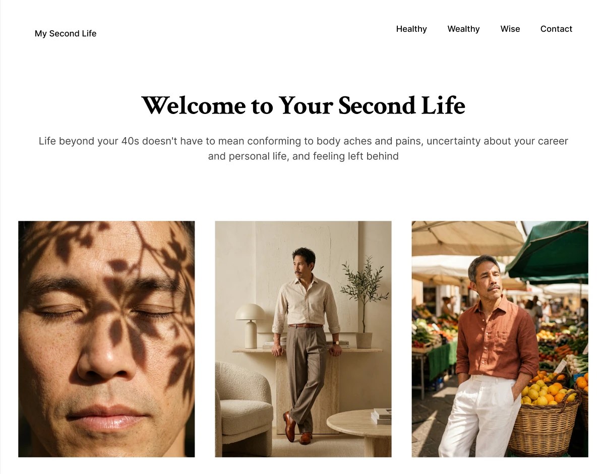
In each iteration, I got Claude to help me fix the layout with blunt instructions: simplify into an image-centric grid, get rid of the colour gradients and unnecessary containers, and aim for a truly minimalist look that feels closest to my initial vision for the website. Most of the polishing effort goes into removing things.
Before anything goes live, I run down the usual suspects:
- purple-to-blue gradients and soft glows;
- headline left, floating card right, pill button underneath;
- highlight colours sprinkled on random words;
- labels explaining what the picture already shows;
- custom controls that are worse than the standard ones;
- anything I can’t justify in a single sentence.
The model won’t make these calls for you. Stripping a design back is a risk, and models are trained to avoid risk, so the cutting falls to you.
The toolkit at a glance
| Tool | What it does in my workflow |
|---|---|
| Captures the look and feel before I can describe it. A “Never” board records what to ban. | |
| Claude | Turns the boards into written design principles, brainstorms directions, writes the build and image prompts, runs the critic. |
| Canva | Fast, high-volume tests of logos, palettes and social formats. The connector lets Claude create designs and apply the Brand Kit. |
| Figma | Precision work on type, spacing, grids and components. Claude reads and writes native frames through MCP. |
| Higgsfield (via MCP) | Images and video generated from inside Claude, in line with the design principles, then upscaled and reformatted. |
Connector features and model line-ups change often. Check what your plan actually includes.
Where it will burn you
- You may not own it. In January 2025 the US Copyright Office concluded that prompts alone don’t give enough human control to make an AI output copyrightable. A logo that came straight out of a generator may not be yours to protect. Rework it by hand, keep your working files, and register it as a trade mark, which protects the brand whoever drew it.
- Pinterest is not a free image library. Most pins belong to somebody. Use them to train your eye and brief the critic, and never use them as assets or copy them.
- Everyone’s moodboard looks the same. Pin the same trending pictures as everybody else and you will rebuild the same look by a longer route. Go further afield: old manuals, your own photographs, places you have actually stood.
- Critics can be confidently wrong. A nine out of ten from a model is one opinion. Put the design in front of real people before you commit.
- Credits disappear quietly. Batch runs and critic loops multiply cost, so set the budget first.
- The tools move monthly. Half the model names in this piece will be stale by Christmas. The method should hold up rather longer.
The bottom line
AI has made taste the scarce input.
These models can now build in an afternoon what used to take a design team weeks. What they can’t do is want something. Pinterest is where I find out what I want and Claude is where I argue about it. Canva and Figma are where I test it, Higgsfield is where I picture it, and the delete key finishes the job. Then I do it all again on the next project.
That’s my setup. If you have a better way of getting AI to design with some backbone, I’d love to hear from you.
Sources
Tool features as of September 2026.
- Anshu Chimala – How to turn your AI into a world-class designer (Lenny’s Newsletter, 1 September 2026)
- Sakana AI – String Seed of Thought
- Pinterest Newsroom – Introducing Gen AI labels (30 April 2025)
- TechCrunch – Pinterest adds controls to limit AI content in your feed (16 October 2025)
- Canva Newsroom – Create on-brand Canva designs directly inside Claude
- Figma Developer Docs – Figma MCP server: write to canvas
- Higgsfield – Higgsfield MCP
- US Copyright Office – Copyright and Artificial Intelligence, Part 2: Copyrightability (January 2025)
- W3C – Understanding WCAG 2.1: Contrast (Minimum)